Provider Digital
Tiles
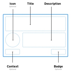
The Tile is a unique component which acts like a button, but contains multiple levels of information and context for the user. The Tile is used often within the design and needs to follow certain rules to maintain clear usability expectations for the user.
Standard Tile
- The entire tile should always be clickable.
- The tile should not contain any form of secondary button.
- The tile should always contain a Title and short Description.
- Tiles within a group or on the same page should always be same height.
Tile Types
Category
The Category Tile is only used on the landing page for Resource Center. It is the only tile to have a dark grey title showing it to be unique and having greater hierarchy to all other tiles. It has a large 128x128 icon and should have a concise title spanning two lines. Update styling on hover.
Static

Hover

Standard
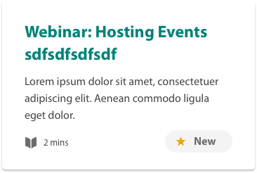
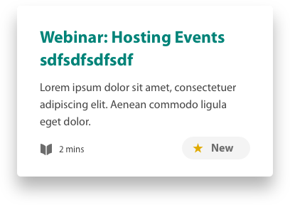
The Standard Tile is the most common and basic tile in the UI. The title should try to be kept to two lines. It contains a description, content type and info area, as well as placement for a badge (e.g. ‘New’). Note: Tiles within a group/page should always be similar size. Update styling on hover.
Tile Character Limit: 110 Characters | Standard 3 lines: 60 Characters
Static
Hover
With Icon
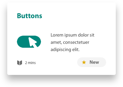
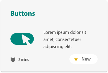
The Standard Tile can contain an icon if deemed appropriate for faster user recognition of content. The icon should always float left and should never exceed 80x80. The descriptive text should indent and thus has a smaller character count. Update styling on hover.
Tile Character Limit: 60 Characters
Static
Hover
Without Subtext
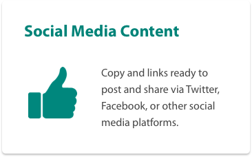
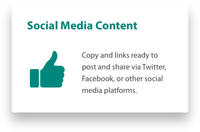
If it is unecessary to display tile contextual information, you can ommit the secondary tile content by using the Without Subtext Tile. The tile is a bit shorter and used mostly on content pages that have subpages as initial links to those pages. Update styling on hover.
Tile Character Limit: 60 Characters
Static
Hover
Locked
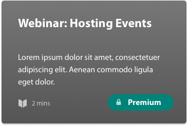
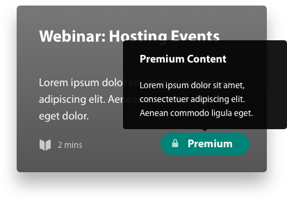
The Locked Tile is used when the content succeeding it is unaccessible to unauthenticated users. The tile contents stays the same as if it were unlocked, but the visual styling changes and the badge ‘Premium’ is shown. A tooltip is displayed above the ‘Premium’ badge on hover. Update styling on hover.
Static
Hover
Locked With Icon
A version of With Tile that is locked. Update styling on hover.
Static
Hover
On White
Tiles should always have a white background unless the tile is displayed on a white background (i.e., content pages). The tile operates the same, but with grey background, darker green title color, and white background ‘New’ badge (if included). Update styling on hover.
Static
Hover
