
Color Palette »
Colors and usage
Typography »
Font styling
Links »
Styling and usage
Buttons »
Sizing and states
Lightbox »
Downloadable template
Having an organized navigation is important for users to find information and complete tasks on the site. The header navigation must remain static on every page as it serves as the global navigation.
On the consumer site the navigation is broken into two lines, with a left aligned navigation. The bottom is reserved for main nav links (procedures, how it works, etc) and secondary links (Log In, For Providers.)
Example

The mega-menu was introduced to display nested items more clearly. This is the best option to organize to the variety and extensive options under each item.
Example

In the case of micro-sites or landing pages you can merge the lines into 1 and align right so users know they are no longer on the main site and can click on the logo to return to the CareCredit homepage. Make sure the logo has sufficient breathing room (min of 60px room from the first nav link to the logo is recommended)
Example

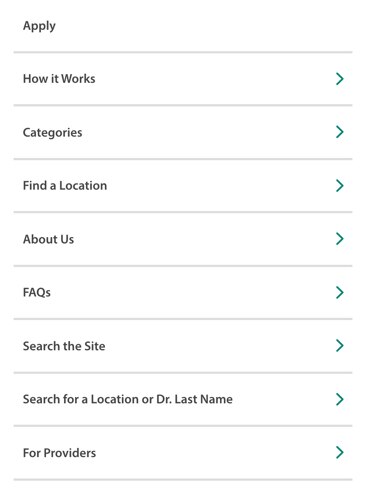
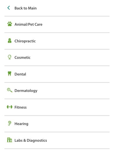
The mobile navigation bar becomes a hamburger menu to the left of the CareCredit Logo and a single CTA is placed on the right for quick access (example. Login or Chat Now). All other links are placed inside the hamburger menu as seen in the example “Level 1”.
Example

Level 1

Level 2

The desktop footer places the navigation links on the right side, with text left aligned. The first column is used for main navigation while the second is used to secondary/legal links.
Example

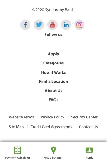
The mobile footer becomes one column with the second column being full width and regular Myriad Pro. This is done to highlight the primary links in the main nav bar.
Marketing content page footer

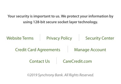
Apply and pay page footer

